
A faster, better checkout experience
As the content designer responsible for Klarna's checkout experience, I constantly asked myself what improvements could be made to fit with the company's ethos of offering a "faster, better checkout experience".
Asking consumers to save their payment method as their favourite on the last step of the purchase funnel had been implemented for a while, with good success.
However, in order to have offer more consumers the “perfect flow” where they skip both the user account and the payment selector step, we needed to increase the "remember me opt-in" and a "saved card".
The business case
There was a business desire to reduce the complexity and try and make it as seamless as possible for the user by getting them to not only save their details but also to save a card. Yet often it's the case that balancing business goals and a great user experience is the content designer's speciality.
We were showing users pop-ups throughout the checkout experience for both 'remember-me' and 'save as favourite' features. I felt this wasn't the best experience and was actually quite intrusive at a time of anxiety for users (completing a purchase in the checkout).

The hypothesis
I crafted a new experience, introducing the "remember me" feature as an additional option on the push screen, and combined it with "save card as favourite".
I hypothesised that combining these two features into one pop-up, we'd not only meet a business need but we would alleviate user anxiety and increase the opt-in rate too.
I mapped out the consumers to the following groups:
-
Do not have a saved favourite and haven’t opted in during the session, or
-
Do not have a cookie and haven’t opted in to be remembered during the session, or
-
Have neither a favourite or cookie and haven’t opted in to either during the session.
I proposed the idea of combining both elements into a single product (combined push) which could then be customised depending on what the user had already signed up to previously. This meant a fully dynamic design to avoid fatigue by repeating messages or actions users had already seen or even done previously!

I create a series of different variations for stakeholder approval. The first variant consisted of a series of modular features which could be removed according to a logic of what the user had previously seen. For example, if a user had already saved their details, they would only be shown the CTA for saving their card for example. This allowed flexibility in terms of pushing users with different messages, while also allowing us to stick to one pop-up and one flexible design.
I wanted to test an even shorter variation to test against the control as well as my other variant, to see if less content resonated with users. It's often crucial to challenge yourself with a variant which goes counter to your first idea – this often covers potential counter-objections later down the line.
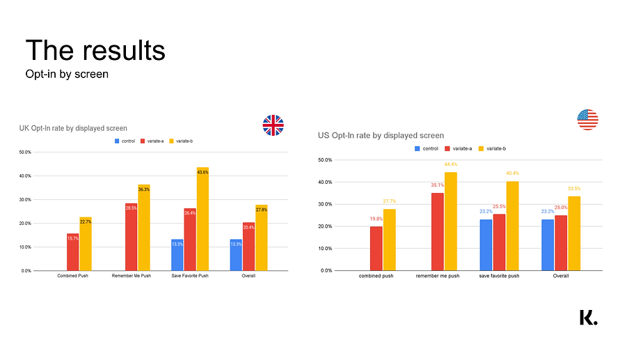
What the numbers said
Variant 2 was the clear winner with huge uplifts. This not only made the checkout experience faster and more efficient for users but also met key business goals at the same time. Win-win.
-
Variate-b led to a 175% (21.pp) increase in the UK, and a 95% (21.7pp) increase in the US in share of orders opting in to remember me, when comparing to Control.
-
Similarly, the favourite opt-in saw an increase of 78% (5.1pp) in the UK and 26% (3.4pp) increase in the US.
-
The results were significant and stakeholders decided to close on variant-B.